Chris D’eLia
CLIENT
Developed as a pilot campaign for West 44th Digital. This project helped establish a new creative offering built around scalable key art across digital, print, and OOH.
Service
Tour campaign design · Visual direction · Scalable key art systems

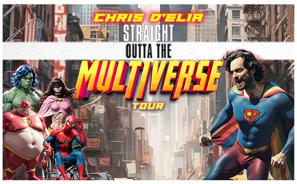
ChALLENGE
The project began with a fan interpretation of the tour title. THe goal was to evolve that initial spark into a cohesive campaign identity that felt cinematic, original, and flexible enough to work across multiple formats.
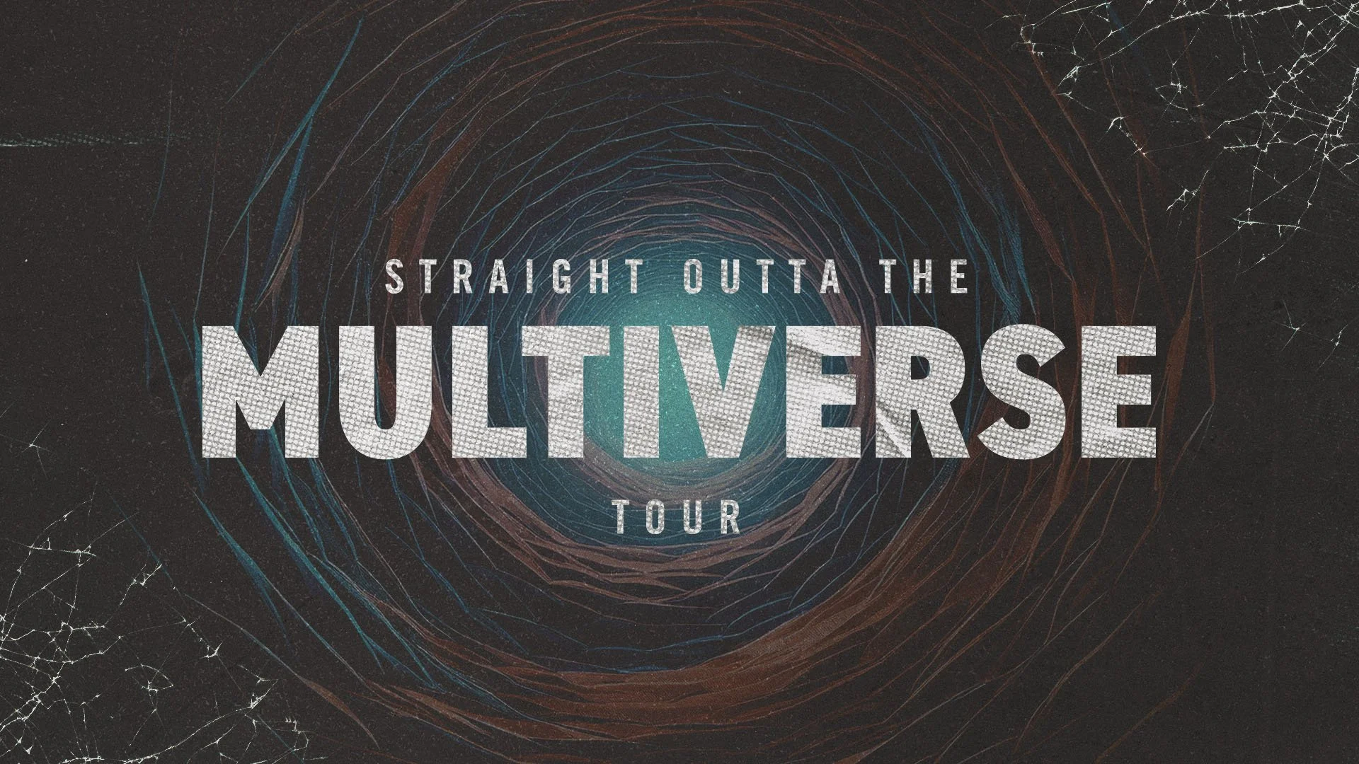
DIRECTION
The creative process began by looking past literal interpretations of the tour title to explore a broader cinematic world. The direction centered on building atmospheric tension.
layering structured typography over deep, composite portraiture and abstract textures to evoke scale, depth, and the feeling of shifting, parallel realities.
DESIGN PRINCIPLEs
Muted tones drive tension without
leaning on comic book tropes.
01
PALETTE DISCIPLINE
High contrast type keeps ticketing clear
while letting hero art dominate.
02
TYPE HIERarchy
Layered portraits textures communicate
scale across print & digital aspect ratios.
03
SPATIAl COMPOSITING
GENERATIVE WORKFLOW
Generative tools were used selectively to develop environmental elements and character variations, then refined and composited into the broader campaign system.
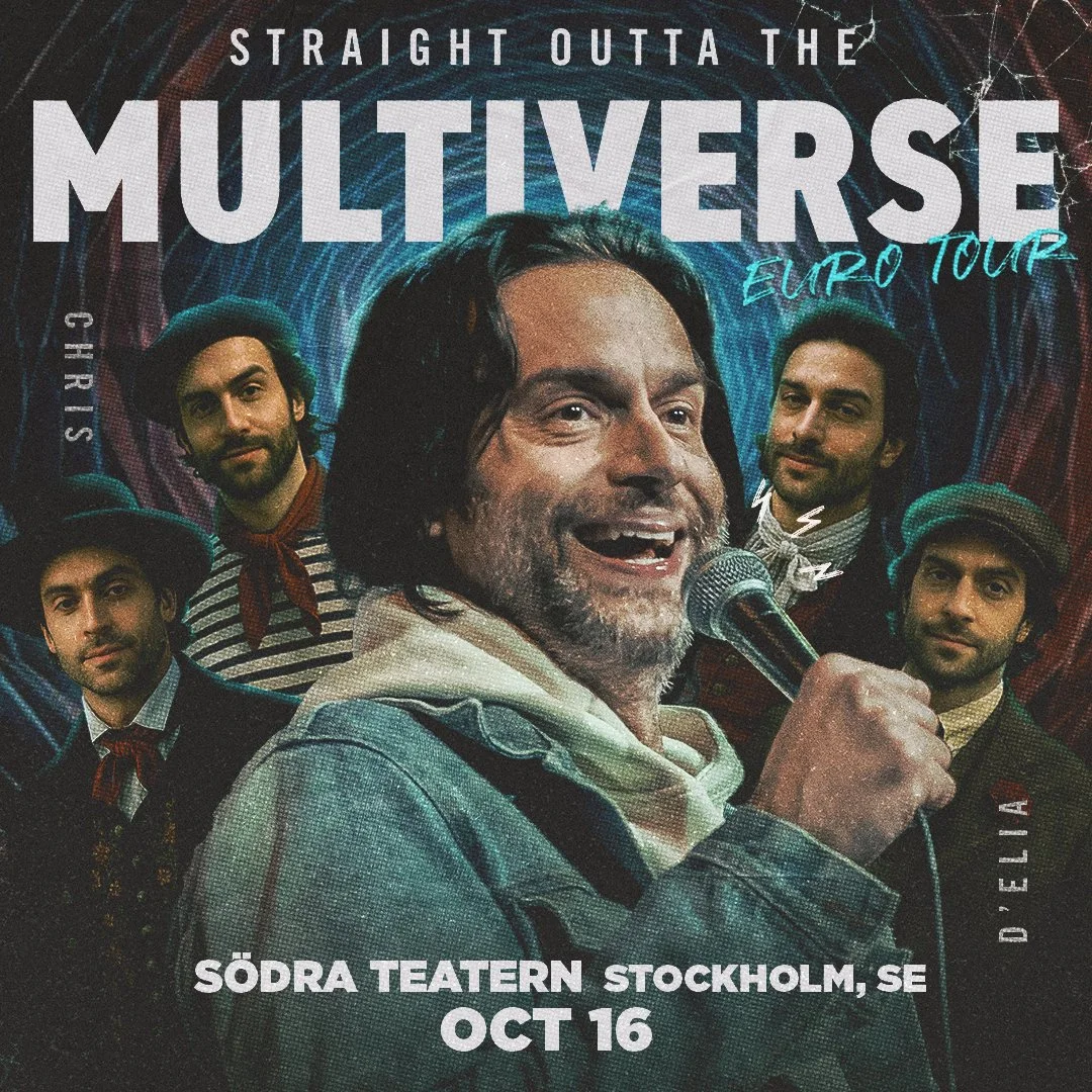
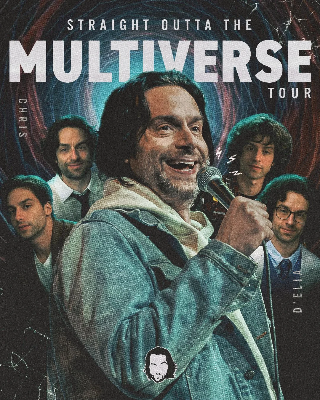
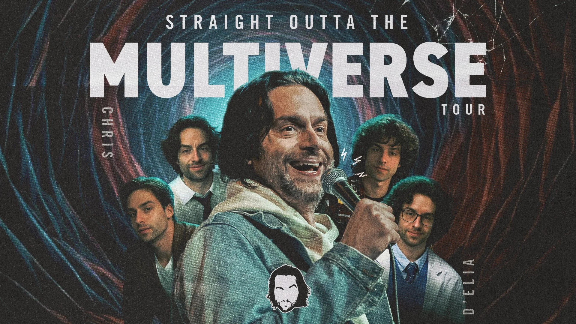
Preferred creative direction shown. Final campaign retained the visual system with client-selected photography.